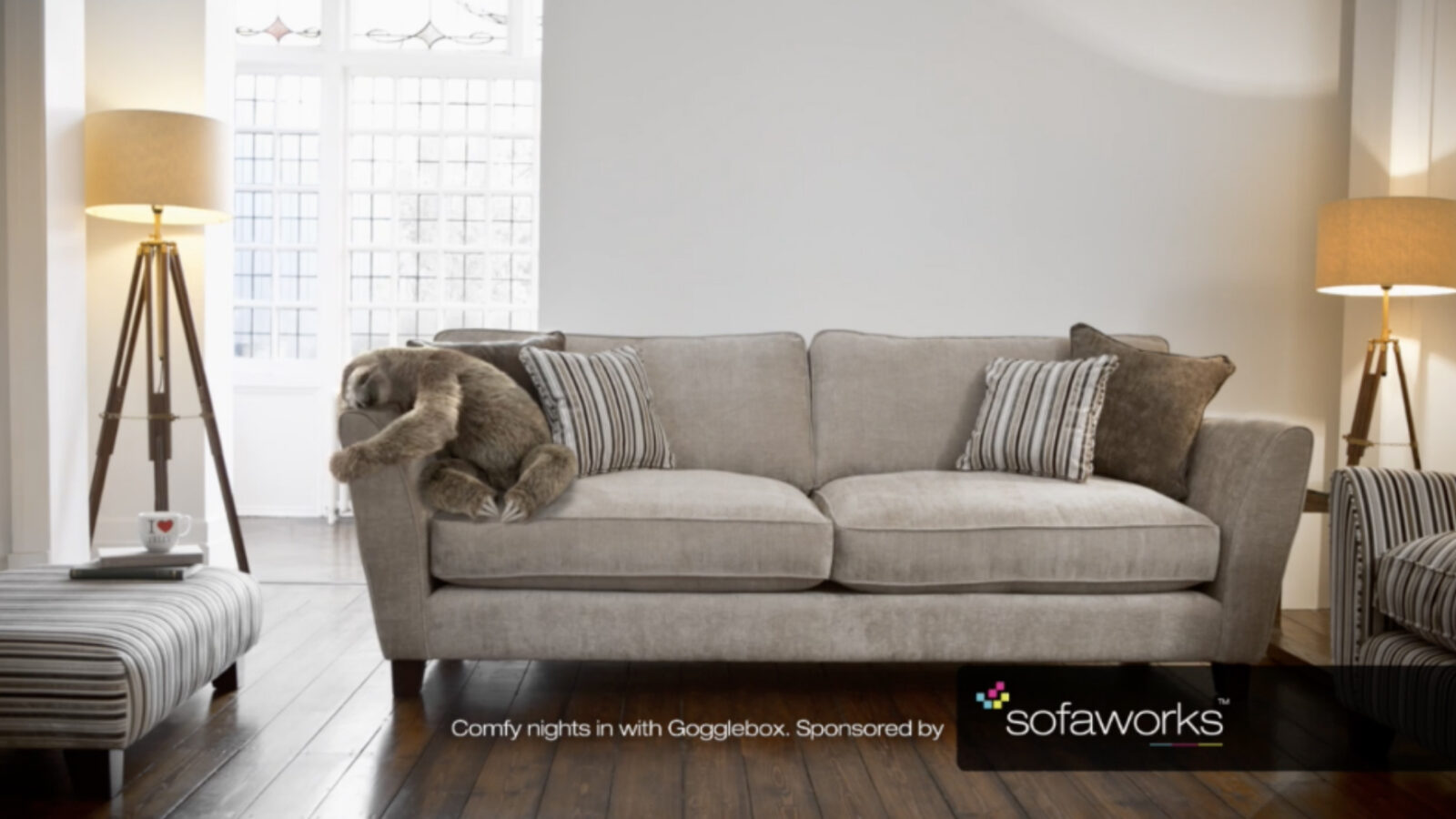
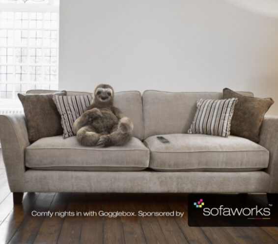
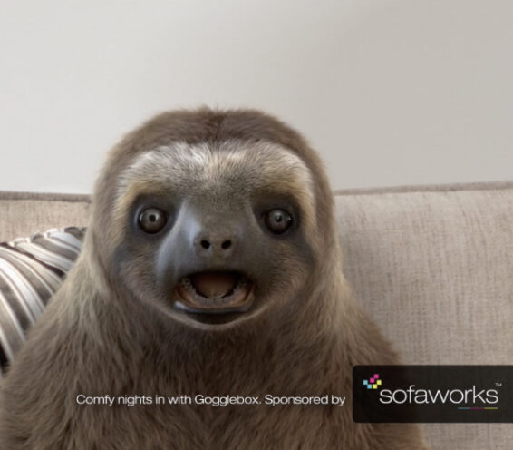
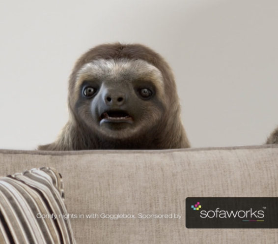
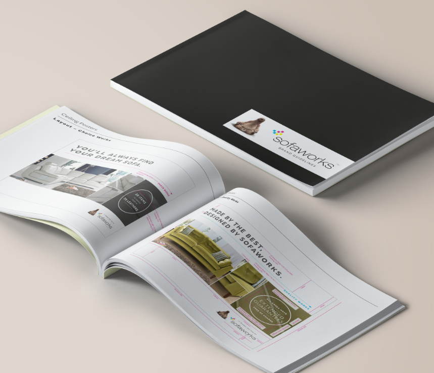
There can't be many people who don't recognise Neil the sloth but there's so much more to Sofaworks than its mascot. We accepted the challenge of taking the brand forward, creating the foundation stone of the company. Starting with a modern typographical style we developed brand guidelines and a unique visual identity.
co-operative above the line ad campaign |
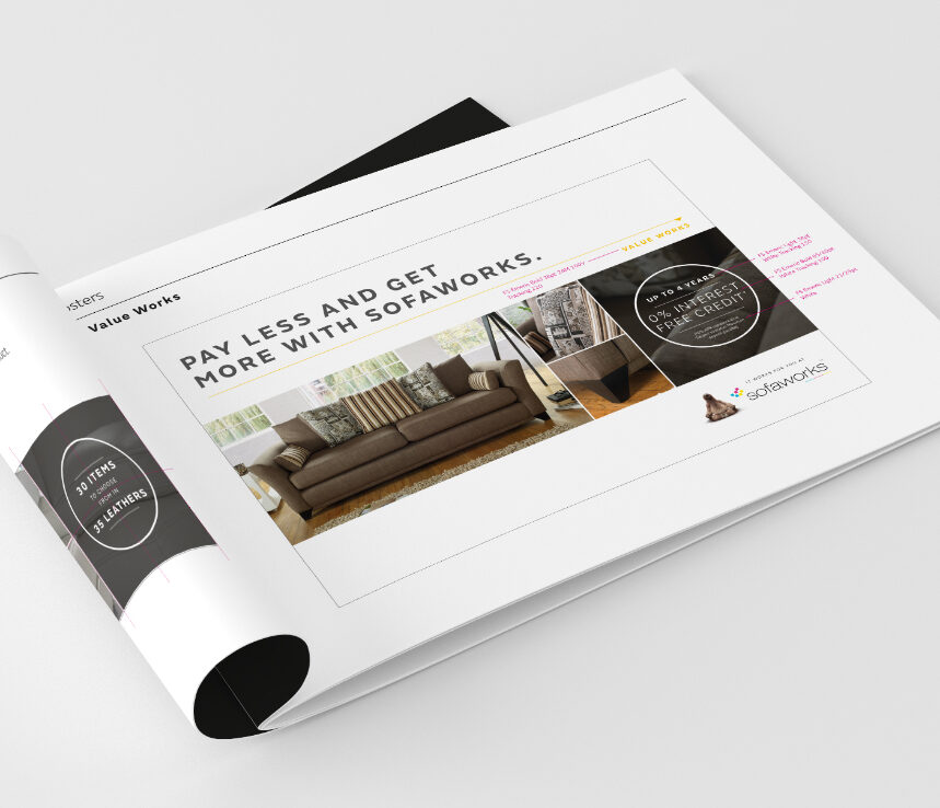
Working with external partners, we developed a number of products that combined the new brand and photographic style to create a unique visual identity. From attention-grabbing in-store point of sale to online and offline collateral, the advertising campaign was designed to pull people in.
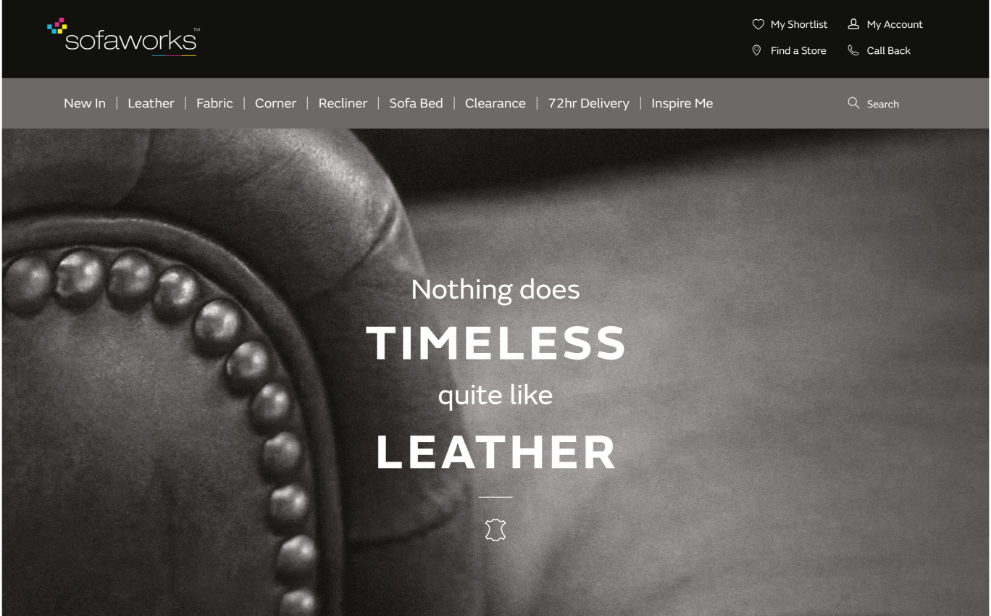
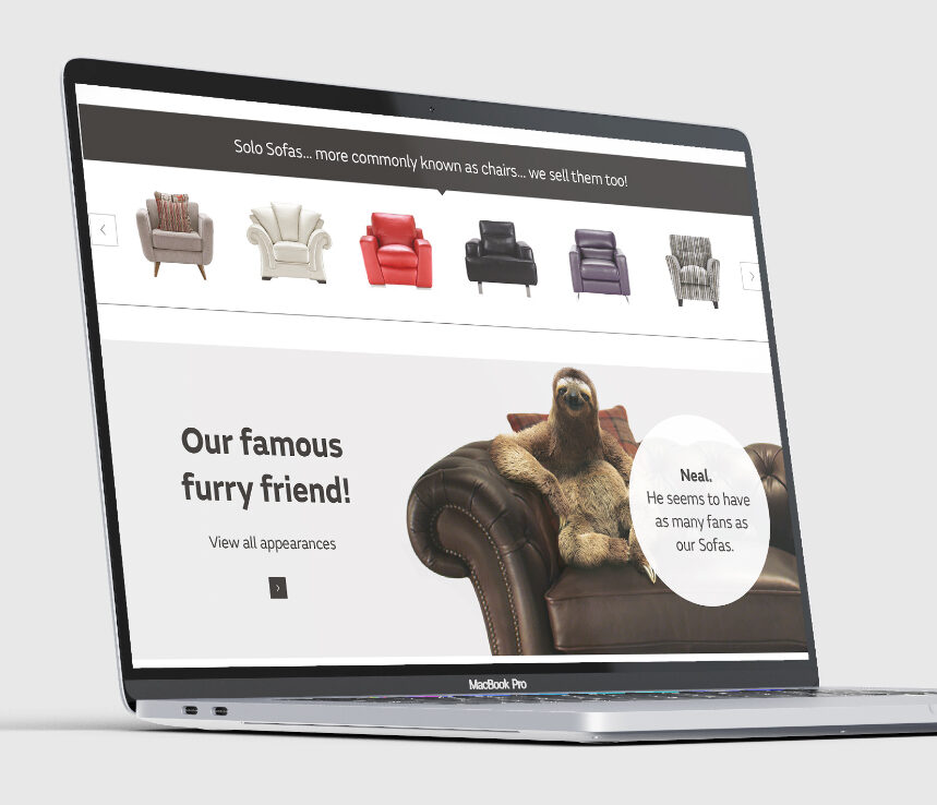
online |
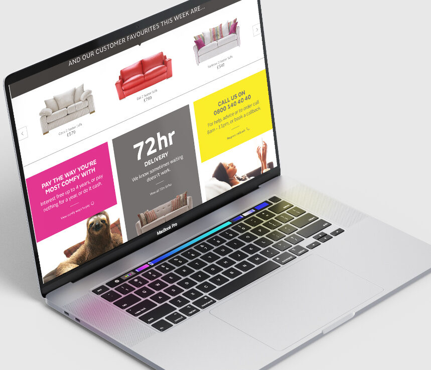
Once the new brand guidelines had been developed, it was clear that their online presence needed the same look and feel. Using a combination of stunning photography, our famous furry friend and a splash of humour, the website became a beautiful place to browse through the furniture range.
artwork |
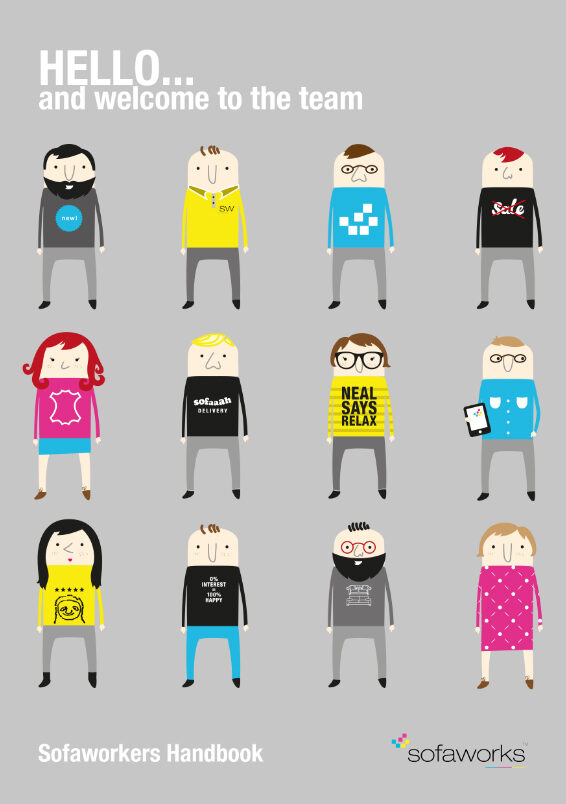
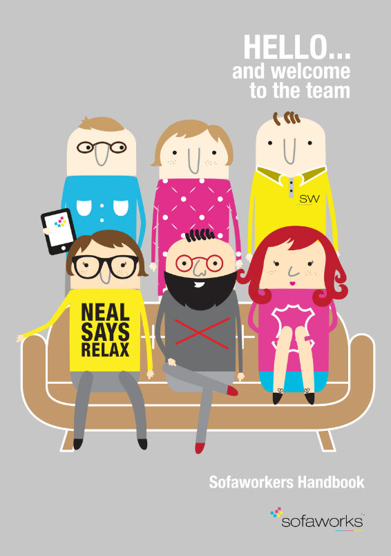
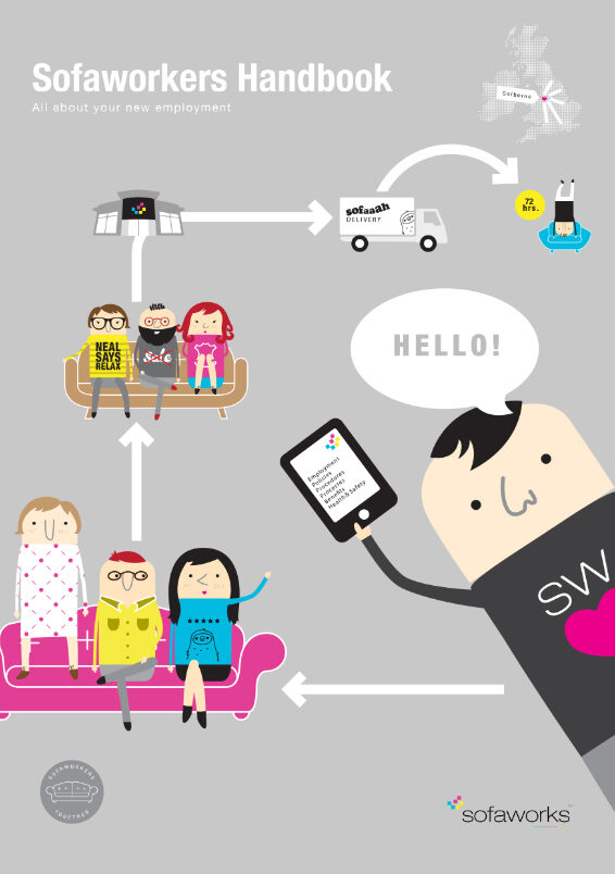
From the sleek customer brochure to the fun employee handbook, we implemented the updated type styles and colour palettes in different ways. The classic photographic style of the brochure perfectly suited that, whereas the slightly whacky illustration style for the handbook showed off the company's sense of humour. Tone of voice was important across all products and, whether viewed separately or as a group, it was obvious that we had kept the personality of the well-established brand while ensuring its standing in the marketplace of the future.
