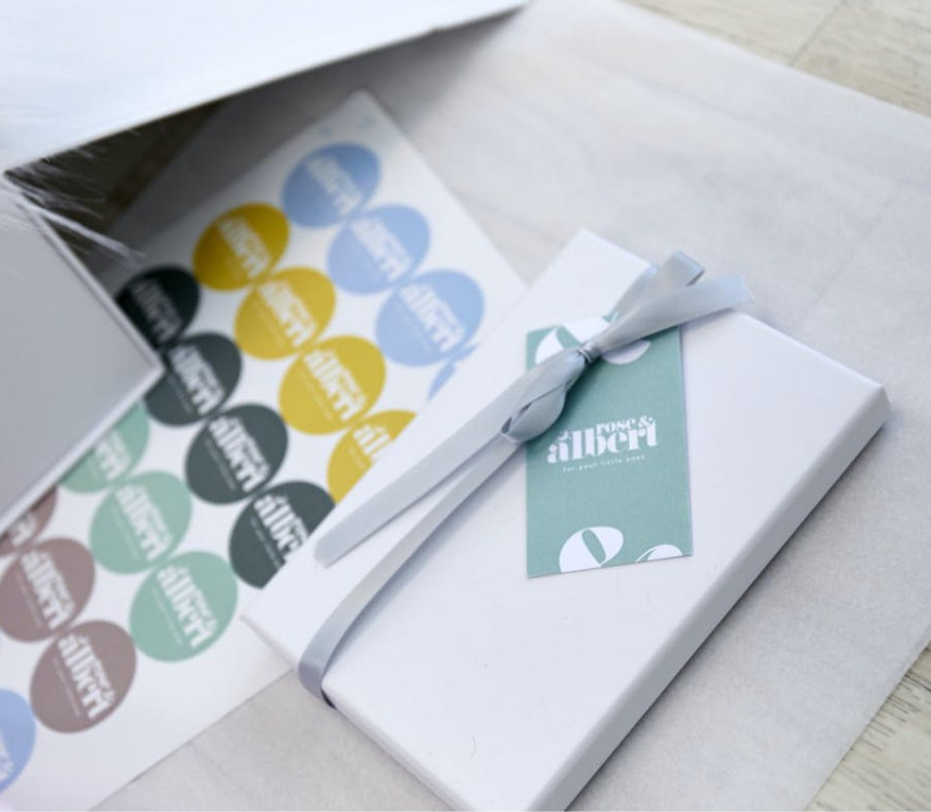
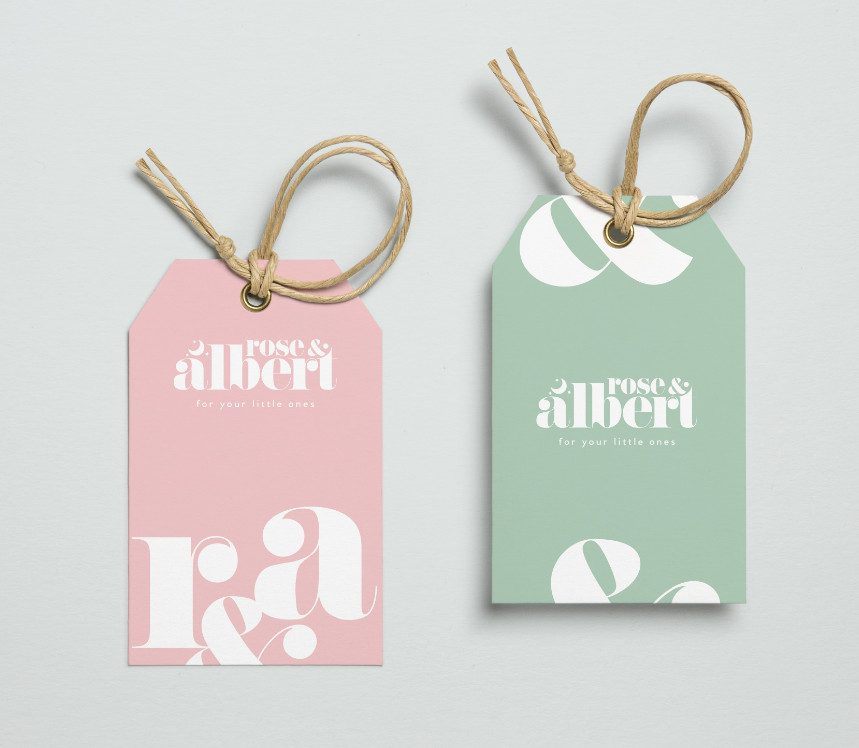
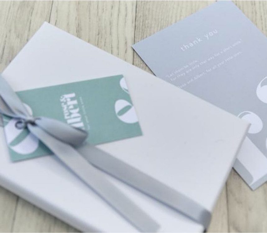
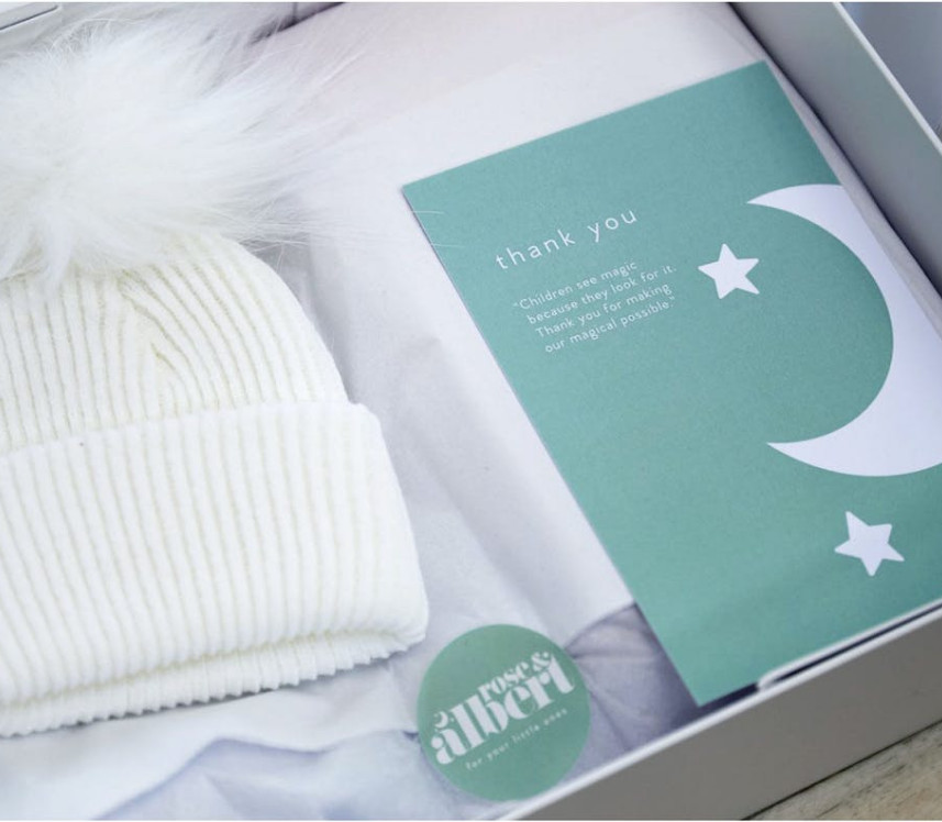
packaging |
Just like children, our packaging design was bright and playful, thanks to the strong use of the logotype, tagline and brand mark, combined with our carefully considered colour palette.
Just like children, our packaging design was bright and playful, thanks to the strong use of the logotype, tagline and brand mark, combined with our carefully considered colour palette.
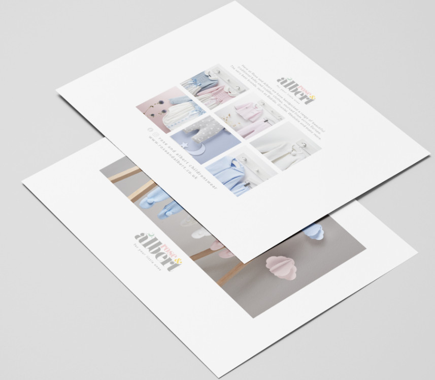
It was our pleasure to follow up the beautiful brand guidelines with a full digital suite that combined the distinctive look and feel with strong UX/UI. Continuing the coherence through all digital communications, such as web, email and social media, is vital to any successful identity.
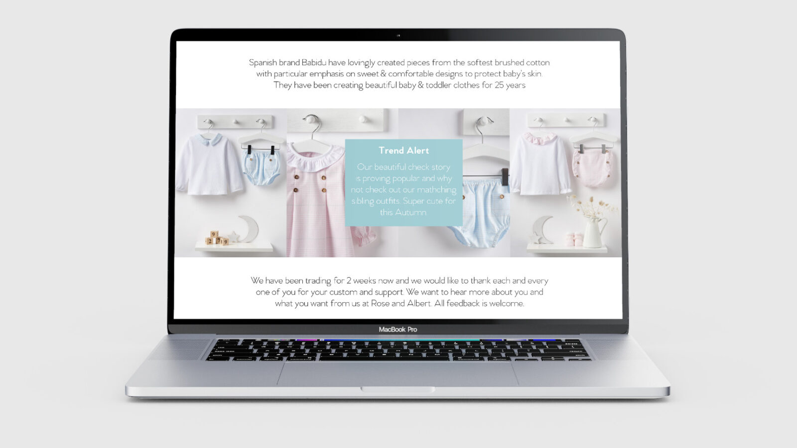
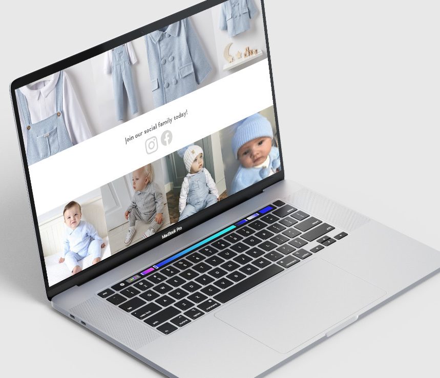
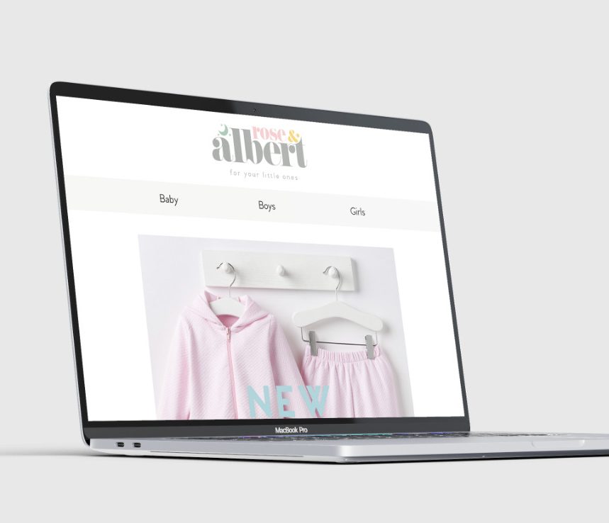
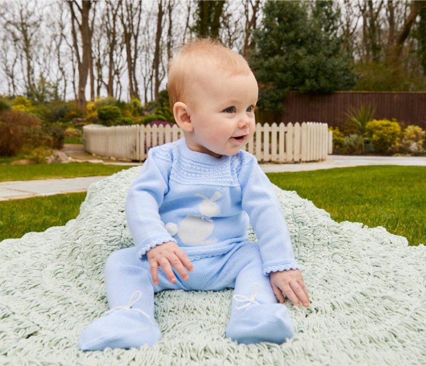
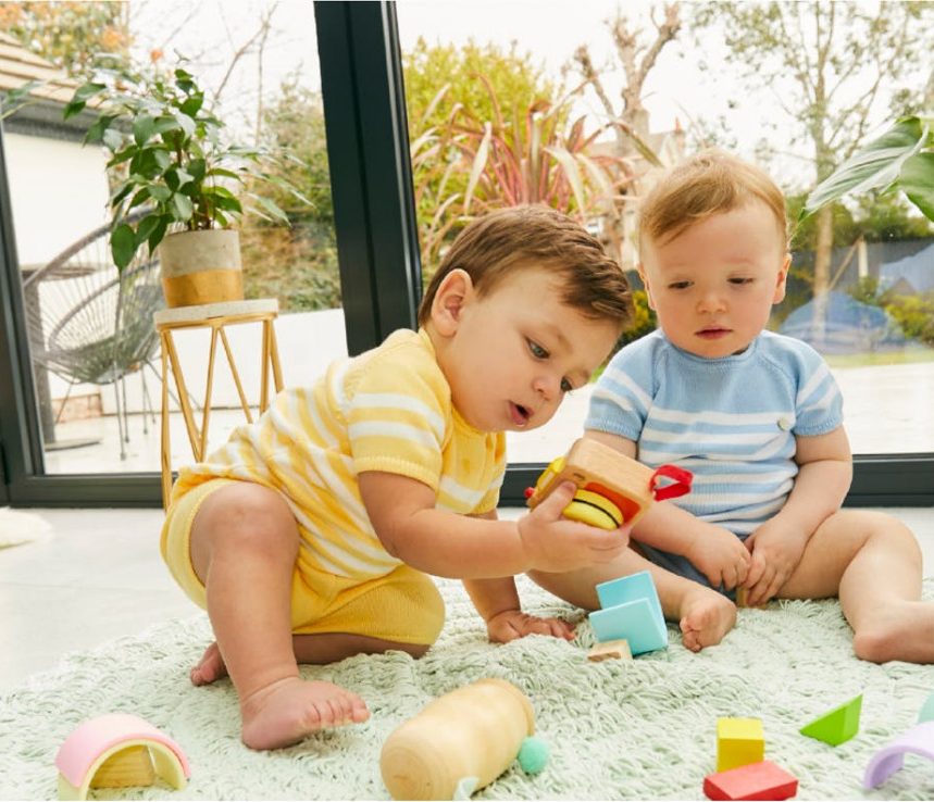
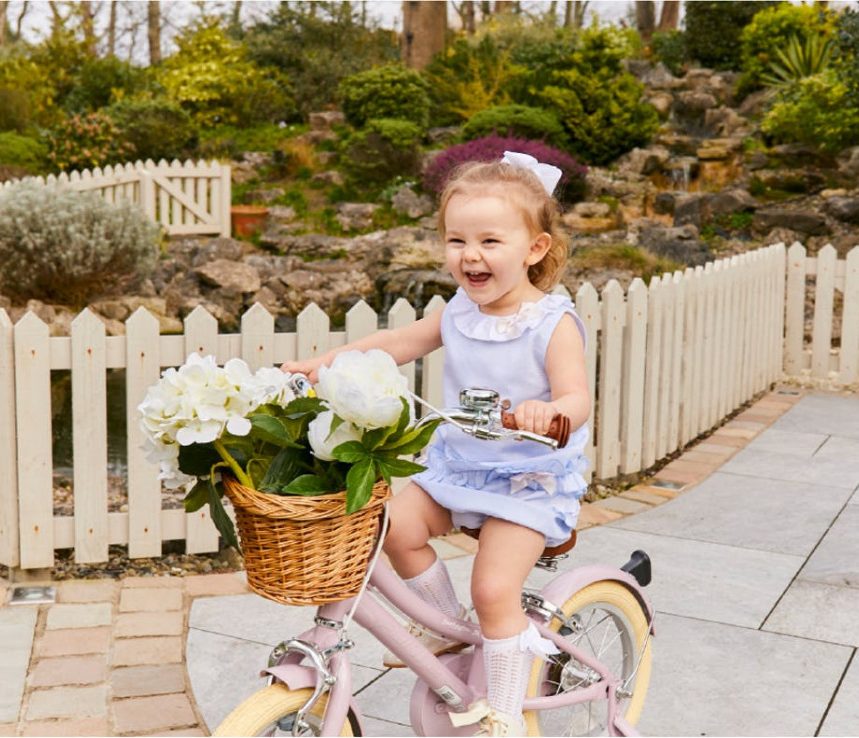
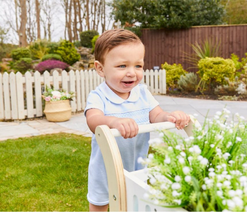
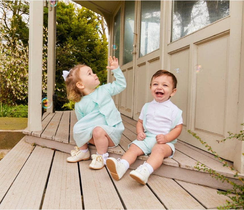
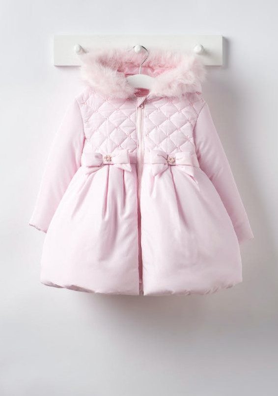
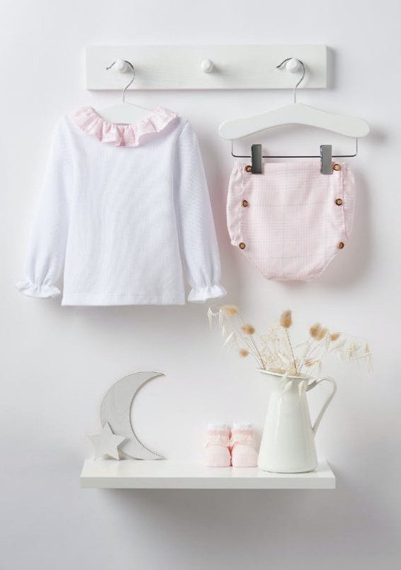
Pairing the new consistent colour palette with a simple and clean photography style kept all imagery focused on the products, while elevating them with a high-end look and feel that perfectly complemented the brand.
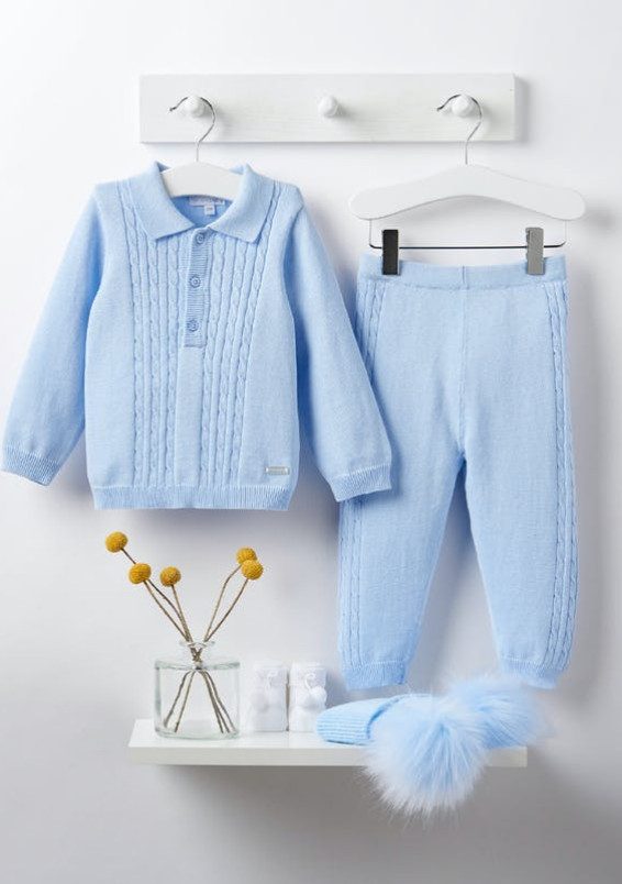
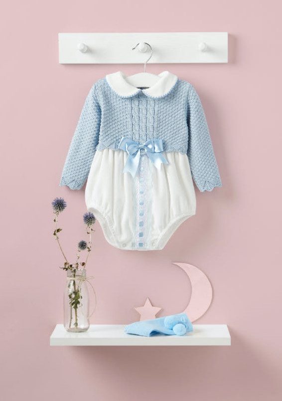
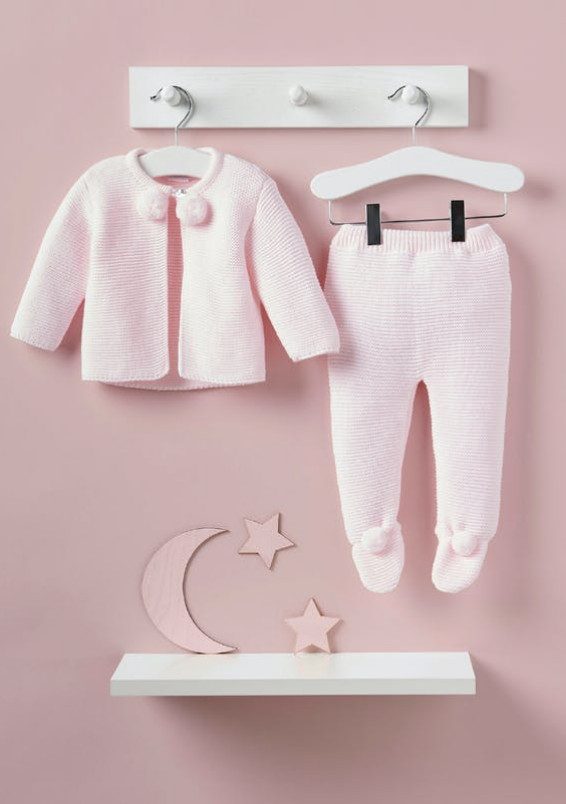
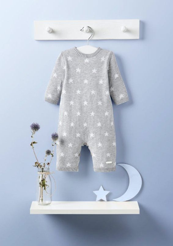
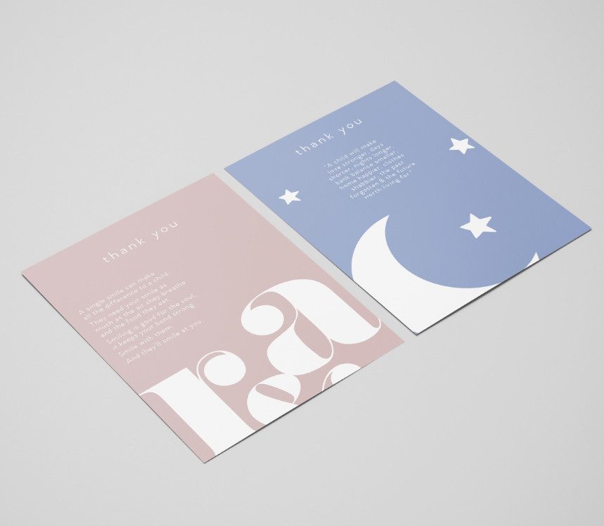
Focusing on the fun and playfulness, it was a joy to create a portfolio of images that could bring a smile to anyone's face. Engaging with the children and keeping them entertained during the photography shoots meant the results exceeded all expectations.