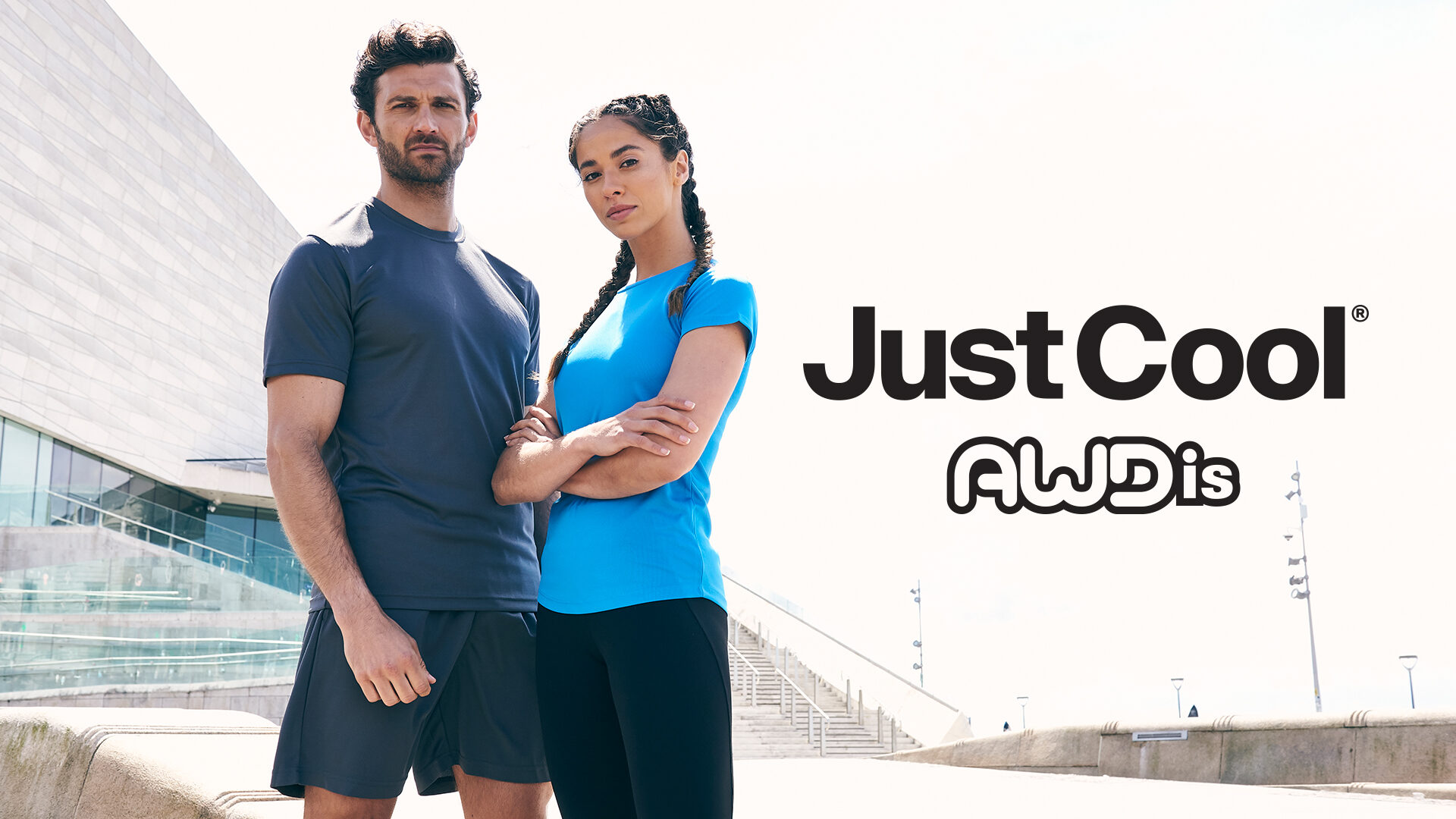
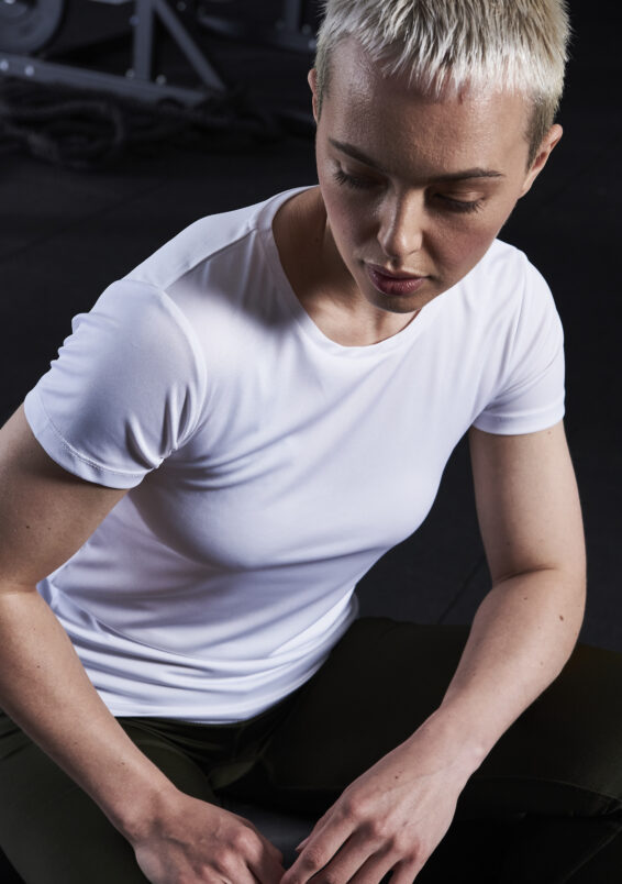
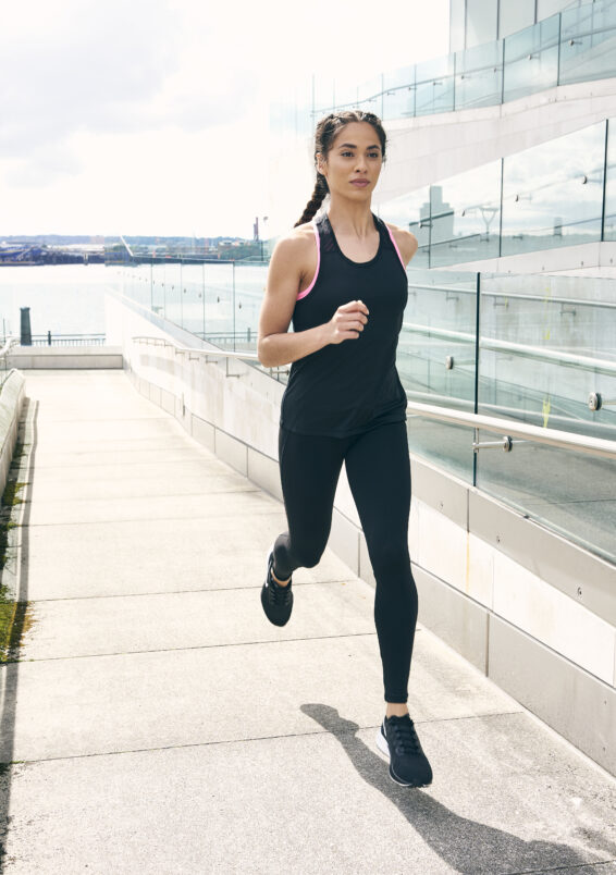
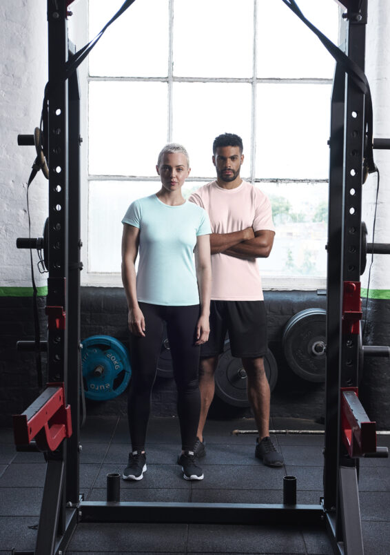
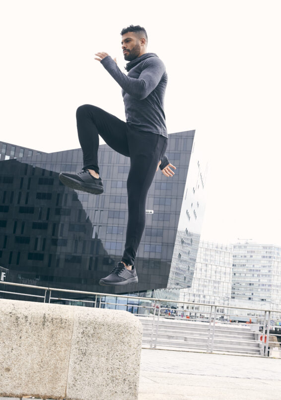
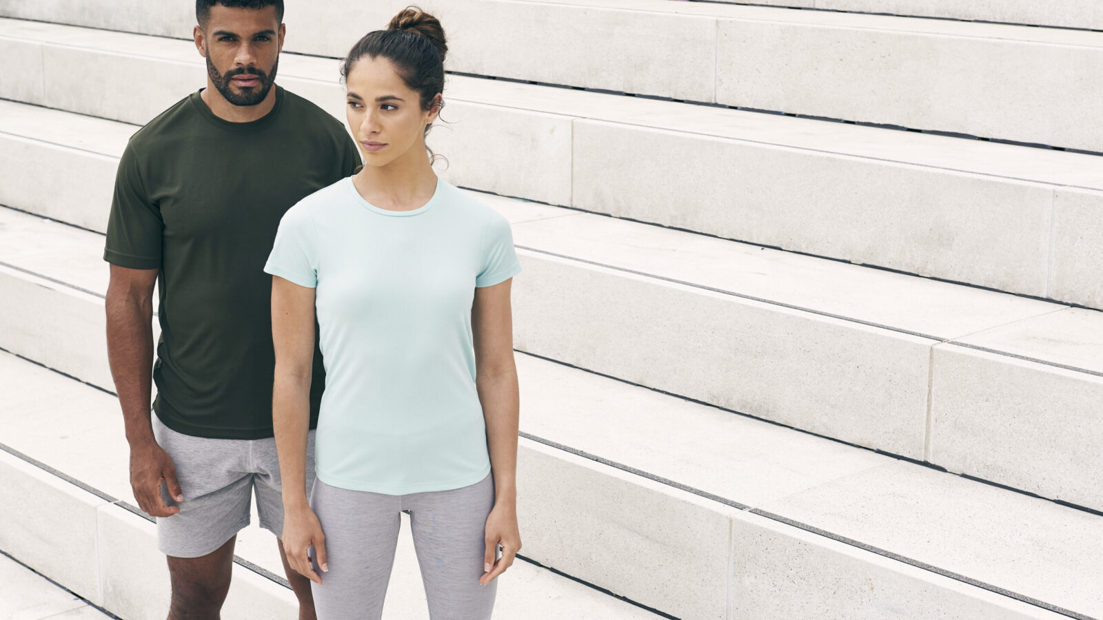
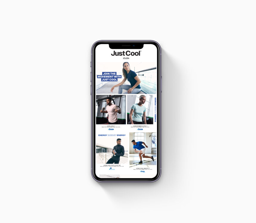
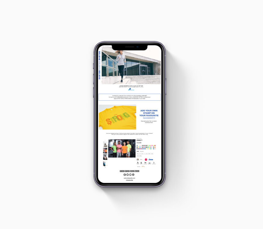
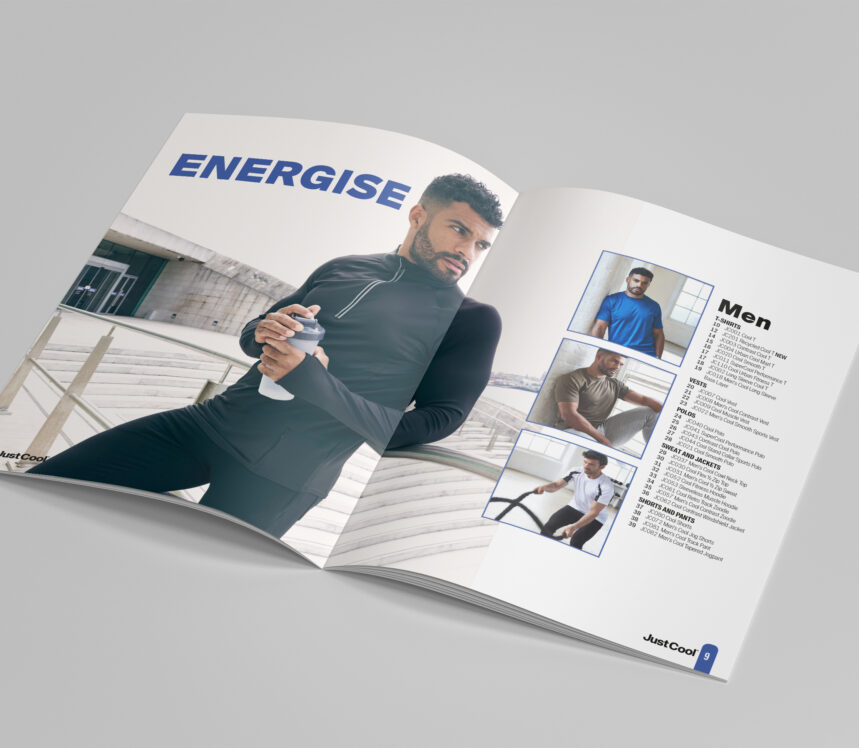
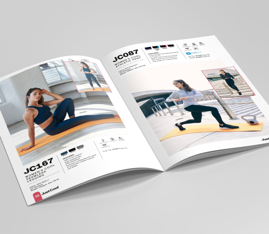
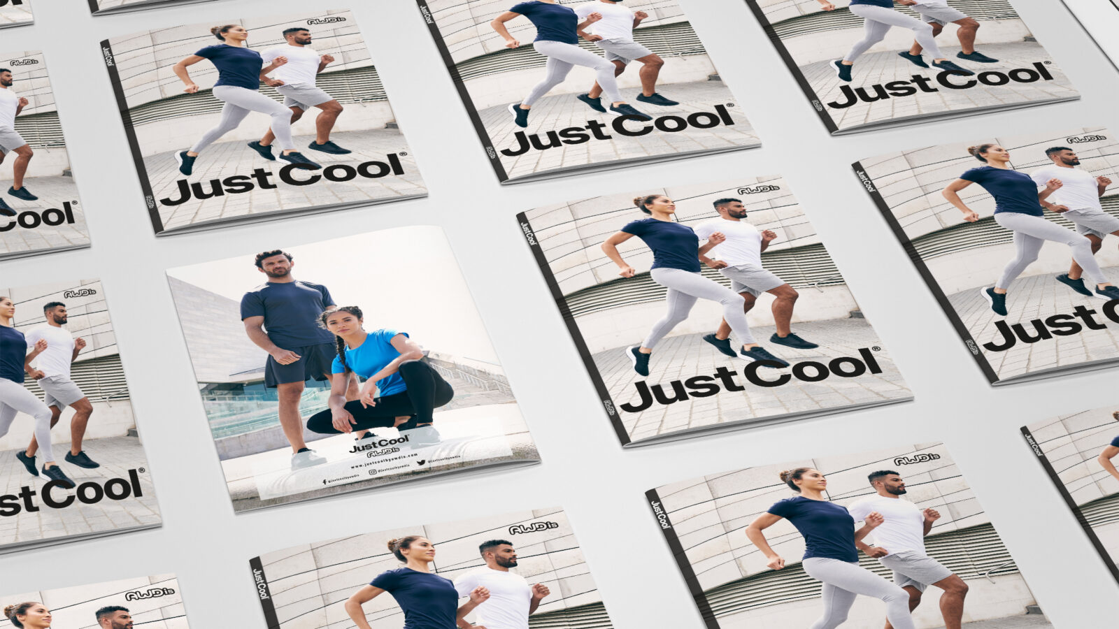
Hard work pays off and we fully understood how we could define their products to spark excitement in the marketplace. Using bold typography and iconic athletic imagery we created a new style, visualising where they needed to strengthen a brand that will successfully follow them into the future.
art direction |
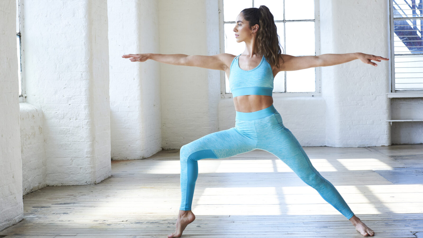
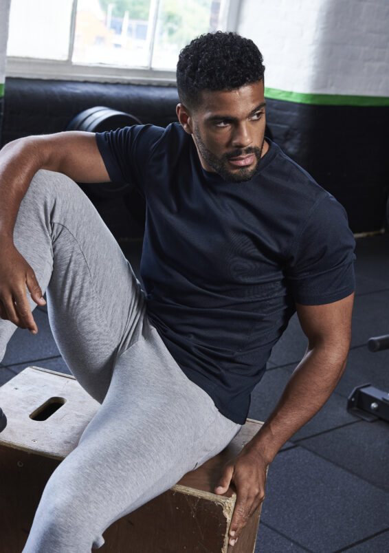
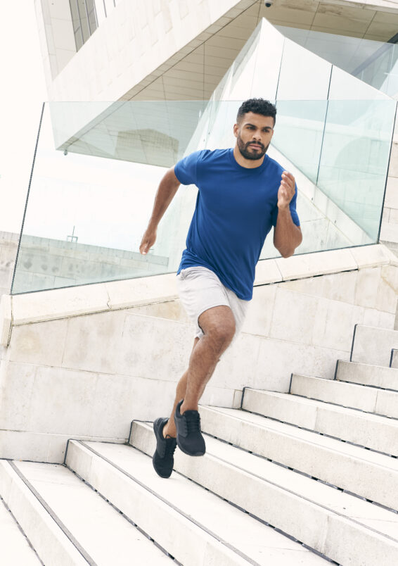
Because sport is for everyone in all environments, we used multiple models and several locations to develop a large portfolio of shots to showcase the entire range. We knew that pushing existing boundaries would create a stronger standing in a sometimes crowded marketplace.
digital |
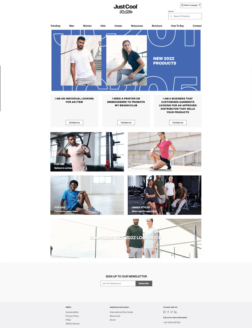
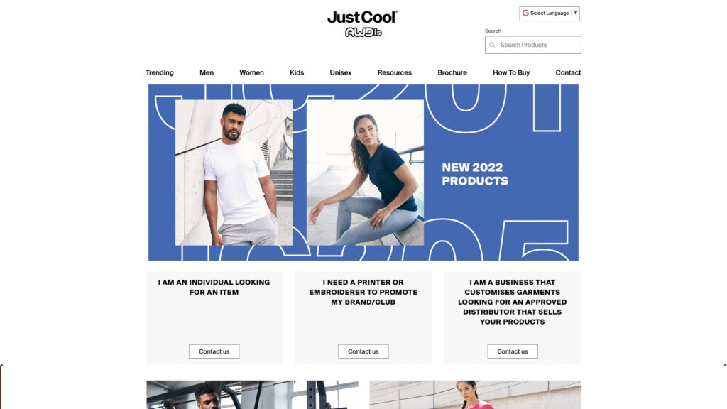
We integrated the rejuvenated branding across all their communications. Combining a clear and simple colour palette with stronger typography we created more dynamic layouts to help customers interact digitally.
brochure |
Any successful organisation relies on a consistent style and brand. We designed their brochure to deliver clear and simple messages that would easily assert its new and exciting identity to a wider audience.
